
It’s been nearly two years since we launched our most iconic commenting layout, Disqus 2012. Since releasing a design refresh last spring, we’ve grown… a lot! Taking into account everything we’ve learned over the years, it was time for the team to design a newer, simpler Disqus experience.
Some of the most noticeable changes include:
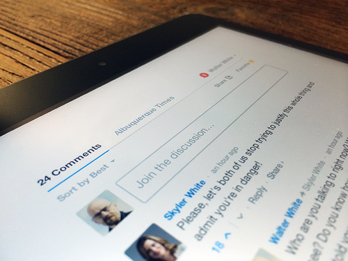
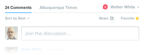
- A redesigned notifications link. Your network updates have been moved from the “My Disqus” tab to the notifications icon. When you have a new notification, the icon will change red and indicate how many new updates are unread.
- The “Community” tab is now the name of the community you’re visiting. Instead of a generic label, it is appropriately named according to the site owner’s name.
- The “Comments” tab name now includes the number of comments instead of including the comment count above the navigation.
- The compose box has been moved below the sorting options. This keeps you in context when you’re joining the discussion.
We have exciting plans for the updated layout. This is just the first chapter for the new design. Many of the features you requested, and some new surprises, are in the works. The new Disqus layout helps us unlock what we think will be Disqus’ most exciting year of design innovation.

I really like it though when I first saw it, I was a little bit lost lol.
ReplyDeleteI really like the changes! They work.
ReplyDeleteWill have to look around.
ReplyDeleteI like it but i wish the notification button was just a bit bigger,i have a hard time seeing the number.
ReplyDeleteVery clean looking, nice job!
ReplyDeleteThanks, I found the extension that messed with stuff => avast! Online Security
ReplyDeleteExcellent :)
ReplyDeleteYou've come a long way since the Horrible Pop up window way back when you launched the Lost Site.
ReplyDeleteI never use the notification bar, so nothing really changed for me.
ReplyDeleteHa yes, a lot of spoilers under the bridge since then ;)
ReplyDelete